Services
Art Direction, Packaging
Industry
Consumer Goods & Retail
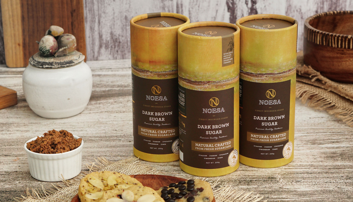
Noesa does more than just make superior brown sugar. On top of that, they emphasize the histories of the key players in the manufacturing process. By doing this, they enhance the worth of each product while showcasing the dedication and close connection behind their brand.
The word "Nusantara" originates from the Sanskrit word "Nusa," which means "island." From Sabang in the west to Merauke Island in the east, Indonesia is a country made up of several islands. In order to create a strong brand identity for Noesa, we first carried out the research process to obtain information on the goals and tactics of the company. After that, we concentrated on telling the tales of the people who had worked on the project, in the hopes that their experiences might inspire others to show kindness to them. Noesa recognises the worth of each individual's contribution to their product and aspires to pay tribute to them by sharing their experiences to customers.
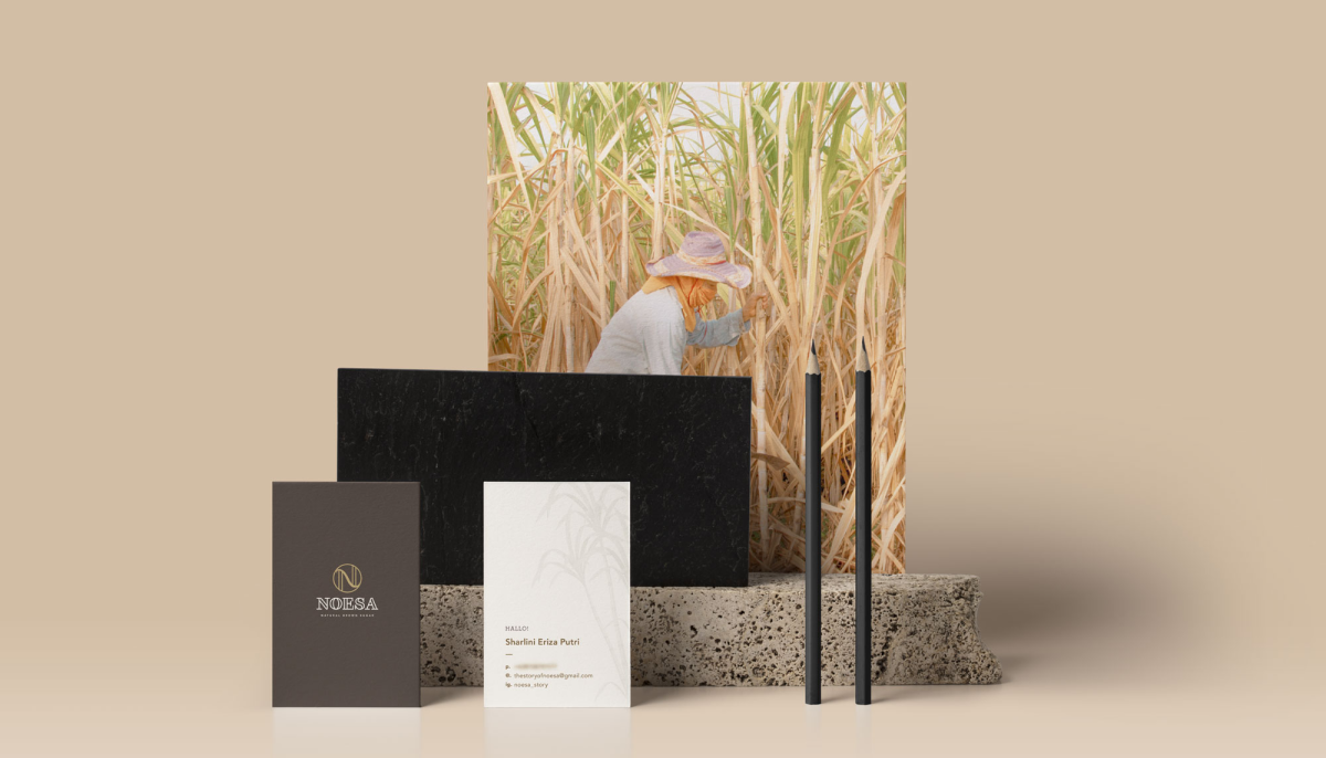
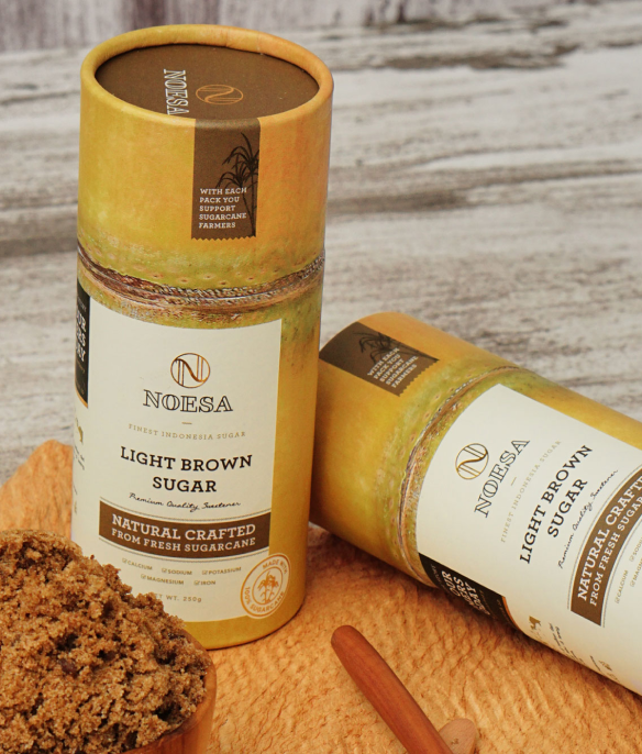
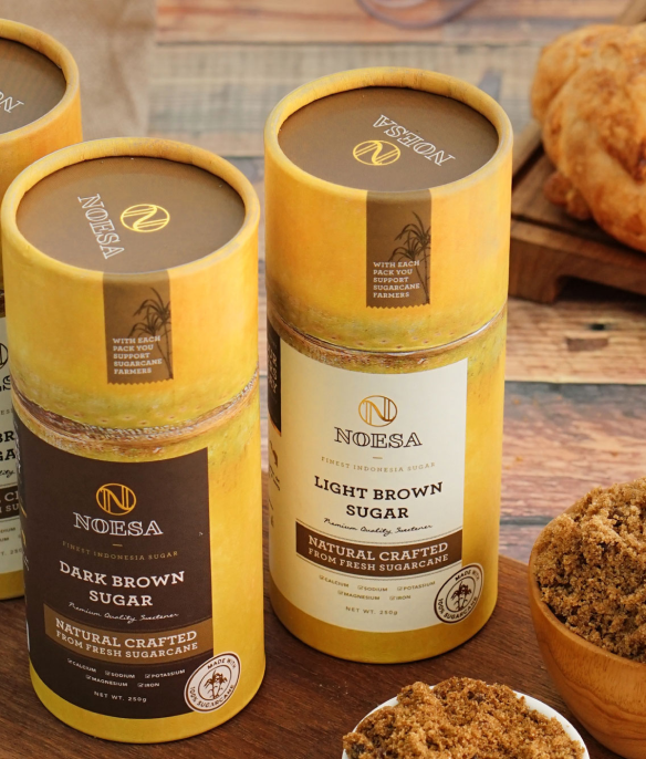
Noesa has offered local farmers in Indonesia's agricultural sector hope and success via their enthusiasm and compassion, much like how sugarcane grows peacefully on formerly empty land. Noesa is humble in their sharing and giving back to both farmers and customers while working relentlessly to accomplish their objectives. Our team have used many sugarcane interpretations in the visual components of Noesa's branding to reflect the significant part that sugarcane plays in the creation of brown sugar. For instance, the package design, which is in the form of a tube that mimics a sugarcane, depicts both the organic shape of the leaf and the rectangular shape of the stem.