Services
Brand Implementation
Industry
Consumer Goods & Retail
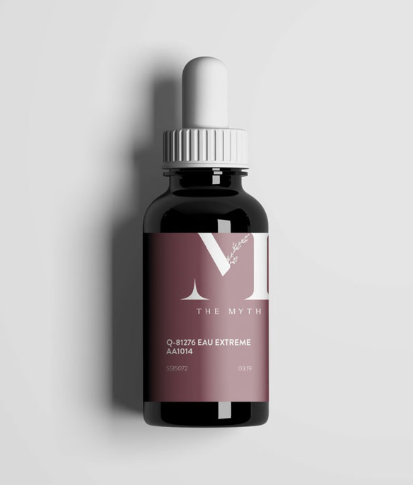
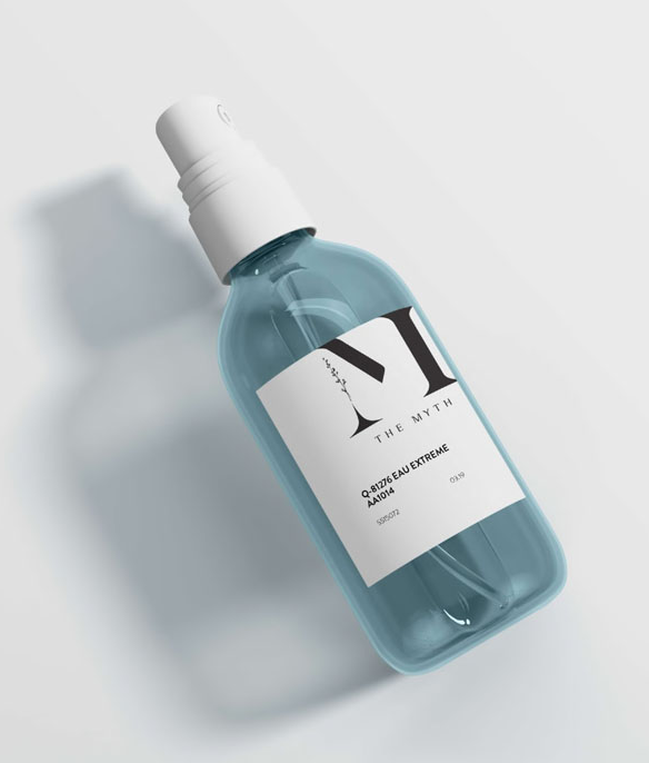
The Myth has played a significant role in the beauty, aroma, and commercial industry by offering a range of fragrances, essential oils, and distributing raw materials in the past two decades. To cater to the specific requirements of their clients, they curate an exquisite collection of high-quality fragrances and raw materials sourced from around the world.
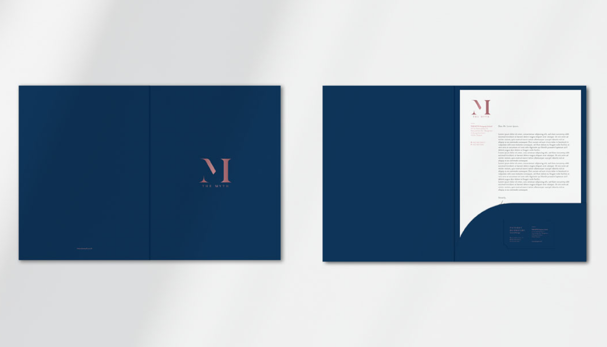
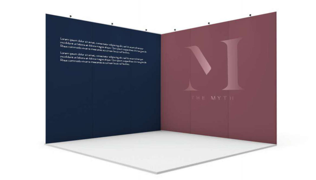
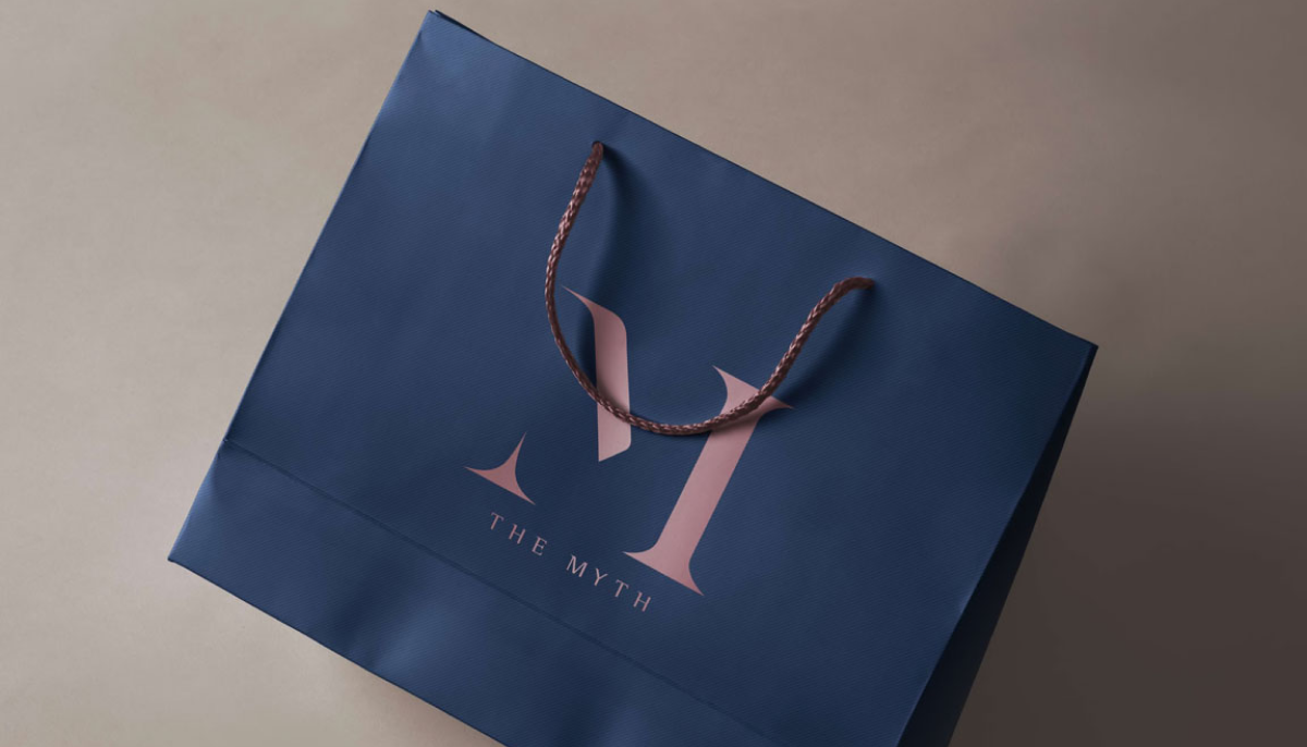
The "M" in The Myth's logo features invisible strokes that allow customers to exercise their imagination and interpretation, leading to different takes and views on the logo, while still maintaining the brand's identity. The selection of colors in The Myth's branding is intended to reflect the brand's proposition of being a leading authority on high-quality materials and resources for refined scents and fragrances.
The colours picked represent their professionalism (blue) and sustainability (green). The company's identity is now represented by a bright and pleasant logo, exactly as they would position their organisation to make the world a better place. Our team then put the new logo into action by creating a graphical element that can be used in numerous APR collaterals like as papers, letters, posters, and even uniforms. These implementations were then standardised using specified principles to provide a uniform and modern look for the brand.